]")
You are here: joeclark.org → Captioning and media access →
Web accessibility → Zoom layouts
Updated 2005.10.10
I didn’t invent the zoom layout, but I have popularized it, and this page is a repository of information on the topic.
A zoom layout uses CSS (cascading stylesheets) to automatically reformat a page so it’s easier for a low-vision user to read. Multiple columns become single columns, navigation gets simplified and put at the top, fonts become bigger, and (usually) colours are set to light on dark.
rev="zoom" to indicate the presence of a zoom layoutSome of the designers who have put zoom layouts to use include:
 I credit Aries Arditi of Lighthouse International with coming up with the idea. He gave a presentation on the needs of low-vision Web-surfers at the American Academy of Optometry conference in 2003.
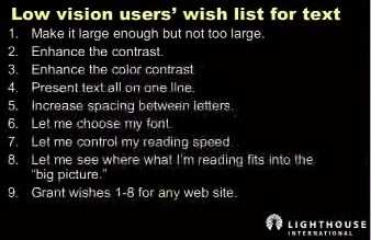
I foolishly didn’t take notes at that session, and Arditi has, for reasons known only to him, not only refused to provide a citation but refused to answer E-mails since then. Nonetheless, I was able to find Arditi’s “Low-vision users’ wish list for text” in another of his presentations, “Web Accessibility and Low Vision,” viewable as a QuickTime movie. His wishlist is as follows:
- Make it large enough but not too large.
- Enhance the contrast.
- Enhance the colour contrast.
- Present text all on one line.
- Increase spacing between letters.
- Let me choose my font.
- Let me control my reading speed.
- Let me see where what I’m reading fits into the big picture.
- Grant [the foregoing wishes] for any Web site.
A zoom layout can do most of those things:
letter-spacing). Usually the page designer choose fonts, and at large sizes, any typical roman or italic typeface will be legible, so, frankly, I don’t think this one’s as important as Arditi does.However, we can’t fit an entire Web page on one line. That goal refers to screen magnifiers that present text word-by-word in an unchanging position onscreen or that focus attention on an unchanging position, meaning you the viewer do not have to scan the whole monitor area. As Arditi puts it, “Don’t make me go back and find the beginning of the next line.” What a zoom layout avoids is horizontal scrolling: The Web site never expands beyond the width of your monitor. It’s up to your screen magnifier to control other reading criteria, including speed (inapplicable to a Web site).
We also signficiantly assist in orienting you within the big picture, but that requirement assumes no change in layout from the original Web site, meaning that you probably would get lost in that original layout. Zoom layouts change things around so you won’t get lost. At worst, you just have to scroll to page top (or possibly also bottom) to navigate.
Another source is the paper “Web Accessibility: A Broader View” by John T. Richards and Vicki L. Hanson, which states:
Given that horizontal scrolling is difficult for everyone, this adaptation has the potential to make browsing more rather then less difficult for our users. To ameliorate this problem, we also provide the option for changing the page layout by linearizing it, reducing the multiple column format to a single column....
The page-linearization feature provides an excellent adaptation in such situations. Using this feature, multi-column pages are transformed into one column. In cases where the Web authors provide skip navigation links, our page linearization feature brings the user directly to the main page content. The original intent of skip navigation links was to enable screen readers to skip over navigational menus and lengthy lists of links to access the primary content more directly. For our purposes, these skip navigation links similarly allow users, without a screen reader, to immediately see the main content. The benefits of page linearization relate to users with low vision who want to reduce screen clutter, users with cognitive limitations who similarly want to reduce screen clutter, and users with limited hand use who wish to reduce horizontal scrolling requirements (particularly with magnified pages).