
After you, the typophile, undergo the requisite hazing and learn to recognize hundreds of typefaces, you’re left with a solid base of one-upmanship: Unlike the teeming masses of the world’s ignorant proles, you can tell the difference between Univers and Helvetica! (And really, why wouldn’t anyone in their right mind use Akzidenz instead?) But as you learn to spot more and more fonts, you come to realize that you have also learned to identify fonts you don’t particularly like.
Fonts you hate, in fact.
You may talk a good talk about design relativism – “There’s no such thing as a bad font, merely a font badly used” – but, in quieter moments, you admit to yourself there really are fonts you cannot stand and wish could be banished from the earth. It’s all well and good to have an opinion, but can you back it up? Instead of viscerally and inexplicably hating a font, can you instead explain why? Can you turn the concept of reviled fonts from hate to debate? And if you’re so very smart and recherché, can you nominate a replacement font that could be used instead of the one you revile?
To explore these pressing questions, Print engaged in some Woodward and Bernstein–esque investigative reporting. Gumshoe, you might say (and that’s a good name for a font, come to think of it). We rang up selected luminaries in typography and graphic design – not always the Usual Suspects, either – and essentially told them “OK, spill!” Then we made them justify their hate.
Surprising, from the standpoint of human psychology, were the designers who had to sit there and think about the question; one even suggested flipping through some specimen books and calling us back. Our attitude is: If, when asked to name the font you hate the most, you do not immediately burst like Krakatoa with years of pent-up frustration, then you’re not much of a “hata” at all. You barely qualify as a “playa hata.” And you’re just too damned nice to be of much use to us.
We can now exclusively reveal the results of our investigation. The font-reviling begins here.
Type consultant (Twardoch.com) · The font of knowledge when it comes to “CE” (Central European) typography (don’t know what an ogonek is? Let Adam handle it for you!) · Polish
“There is one typeface that is quite recent and I quite wholeheartedly hate, that is Fago from FontShop. That is just hilariously ugly for me. And especially the black cuts are very ugly.... To me it sort of it looks to me like a Verdana ripoff with, you know, some characters sort of designed the other way [so as] not make it too similar. Like g in Verdana is two-storey and the g in Fago is three-storey, but that’s more or less it.... Fago sort of extends the idea [of Verdana] and extends the very basic set of weights that Verdana offers, but this sort of artificially-pushed huge number of styles, weights, and widths that Fago actually contains – it just doesn’t work.
“The extra-bold styles and the wide styles are really ugly because they clearly look extrapolated. And you sort of clearly see that the arithmetic extrapolation didn’t really work out because there’s something sort of bad going on there, and there’s too much weight in some places, and it really isn’t optically well-balanced.”
And in its stead? “I probably would put something like a News Gothic.... I would start with a Multiple Master version of News Gothic if I really needed a sansserif with a sort of large set of weights. I really like the structure of News Gothic and sort of think there hasn’t been anything really very good since then, except for possibly Thesis,” the sprawling typeface family by Luc(as) de Groot.
“And if I really wanted a grotesk or a sansserif for multilingual jobs that I sometimes do, I would use the new Helvetica Linotype because it’s been greatly reworked for language coverage... and in this outfit the Helvetica letterforms get a new glamour or glory that I never thought they might.” (Twardoch notes that he did free consulting work for Linotype on CE variants of that Helvetica remix.)
Designer (GerardUnger.com) of dozens of faces, including Swift, Gulliver, Flora, and Amerigo · Expertise in engineered fonts for newspapers · Dutch
“Actually, there are not many fonts I hate and the basis of this is I am basically a very curious person.... But there is a font from my youth, Reiner Script. It’s one of the oddest fonts there is. It’s from the ’50s – a beautiful period piece. Imre Reiner was a Hungarian and was a very idiosyncratic designer. Because I was going through life at the time with pimples, I associate it with pimples, and that’s why I hate it, though not very much.
“There is nothing I love to hate. There is one font I hate to hate, because every time I see it’s not very well designed – it’s too inconsistent. That font is Rotis, and I’m not the only one who hates it. The problem with Rotis is that some of the characters, like the e for example – they don’t belong there. [Also] the c. They fall over backwards. And I do not understand why there are so many designers who like it and like to use it. I know, for example, the Japanese, who don’t know much about Roman typefaces on the whole, see it as different, and for that reason interesting, But I think that’s the wrong reason.”
What would you use instead? “I would design a font to the specifications... though I must say I’m not much in this whole fad of doing a serif and a sansserif and an in-between. This has become such a big preference. When I started out in the profession, it was something brand-new, [though] it had been done in the ’30s before, but it was new for mass-produced fonts to make coordinated designs for sansserif and serif faces, as later has been done by Sumner Stone.”
Pronounced “Tracey” (TreacyFaces.com) · Type designer (Forever Sans, Neue Neuland) and art director
“Helvetica is one for me that seems to have no redeeming social value. It’s one of those designs that, as perfectly constructed as it seems to be, when you actually try to set with the traditional normal or open [tracking], it becomes completely uninvolving and hard to read and vanilla. And if you set it tight, the design of the characters because so internally oriented, one character doesn’t propel you to the next character to start knitting words together effectively. I find it to be very static. Univers is the same. As interestingly clean as they are, they just seem to me to be very uninvolving.”
What would you suggest instead, then? (Brace yourselves, readers: Looks like we’ve got a revival on our hands.) “I wouldn’t recommend one of my faces for something like this, although Forever sets much better. I actually prefer News Gothic. It’s actually a wonderful design.... Terminals on the s or the c or something like that, maybe they could be a little bit different, but by and large, it’s a wonderful face, better than any cut of Franklin Gothic.”
Petr van Blokland (Petr.com) is not in fact his brother Erik van Blokland (of Letterror) and also not Frank Blokland (of Dutch Type Foundry) · Designer of “heavy-duty” fonts Productus and Proforma for use in forms design · Dutch
What font do you think you hate, Petr? “I think Chicago.... It was a good font when it was in the original Mac or original bitmap size, but the problem is that they made an outline of it, and by itself it’s still no problem, but people start using it, especially large, and it’s even more a non-font than Helvetica is. And there’s all kinds of mismatching in weights that comes from enlarging a rough bitmap, which I would love to fix.
“But still, as a typographer and type designer, you have to make yourself insensitive to anything you see in the outside world, otherwise you keep being irritated by that.” (Testify, Petr!) “[Chicago’s] characteristics really come from the capabilities that you have when you have a small pixel font.... Like the curves going out of a stem leading into a triangle, which is typical of an N or a U – they’ve completely disappeared [in Chicago]....
“All the other ‘fun fonts’ are fun,” he continues, suggesting Kosmik by Letterror as a fun “fun font.” “They are meant that way and they have some kind of joke inside, But if you enlarge a small pixel size and do the rounding off and enlarge it, it’s just wrong, because you could make it better wrong than it is and it could look convincing, but now it is generated from something that is supposed to look a certain way when it’s small.”
The replacement? “With [Mac OS X], the antialiasing is so good that I think the system fonts are fairly good now, and in combination with the flat screens of Mac, it gets to a point where you hardly notice differences with printed page. It gets there; there’s long way to go, but since there is such a clean match between the hardware and the software that Apple has, you know for sure that this is what it’s going to be.”
(Needless to say, Petr’s confidence in Apple screen fonts is not universally shared. See the sidebar illustration by David Berlow.)
Designer (Typofonderie.com) of Parisine, Apolline, Angie, and a range of custom fonts for newspapers and signage · French
“DIN!” he exclaims. “It is difficult to not like a typeface itself. Generally it is more the use of the typeface than the typeface itself, but in the case of DIN, it seems somewhere both, because... it’s used everywhere from perfume to products for babies to petroleum companies to movies, everything.... For cultural stuff it is the new typeface for the complete identity of the Centre Georges Pompidou.
“There is no reason to use this font, because if you look at the background of the typeface, it is a typeface designed not by type designers but by engineers.” (DIN stands for Deutsches Institut für Normung, or German Standards Institute.) “So when you begin to use this kind of typeface for cultural work, the effect is in reverse if you know the story of the typeface. Because DIN is not normally the system used by graphic design but by engineers. It’s very straight, with no feelings, not human at all.
You may now wave your magic wand, Jean-François, and replace DIN. With what? “It depends. It’s difficult to give a general feeling on the choice of the typeface. You need to flow with no personal motivation. Typeface, it’s cultural thing, so when you begin to use typeface, the cultural considerations are very important.... Like we can compare examples for the Centre Georges Pompidou. Walker [by Matthew Carter for the Walker Art Center in Minnesota] is a perfectly good counterexample to DIN in France, because it seems that the buildings are quite similar to the Centre Georges Pompidou’s. With this new typeface – or quite old now – they give all the different facets of the institution, the different aspects, la variété as we say in France....
“But not DIN! Not DIN, please! DIN is in some way like Helvetica or Times; there is no choice in DIN. The typeface expresses nothing in particular.”
We love the passion of the French.
 Apart from the arriviste Arial, by far the most-widely-hated font among graphic designers is Souvenir. I don’t really see why. It’s unique, systematic, and “friendly,” as Jean-François Porchez describes it, likening it to Antique Olive. Plus it works astoundingly well at tiny point sizes in, say, dictionaries. (Benguiat does, too.)
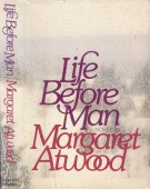
It seems that middle-aged designers associate Souvenir with the decade that taste forgot, the 1970s. But, quite by accident, I found a usage of Souvenir from 1979 that’s winsome, calligraphic, and fully appropriate: The cover of the Simon and Schuster hardback of Margaret (“Peggy”) Atwood’s Life Before Man. “Jacket design © 1979 by Robert Anthony, Inc.”
I guess I’ll be on the lookout for more such examples. A lifetime quest, shurely.
Posted 2003.08.17 ¶ Updated 2003.10.04, 2010.09.19
You were here: joeclark.org → Design → Print articles → Reviled fonts