![[Symbolizing accessibility (Joe Clark: Media access)] Joe Clark: Media access](jcma.gif)
You are here: joeclark.org → Captioning and media access →
Symbolizing accessibility → DVS & A.D.
Updated 2002.04.30
Symbolizing accessibility:
DVS & A.D.
Here’s an update on the quest for a universal symbol for audio description. If you haven’t done so already, read the original piece, “Symbolizing accessibility.”
Universal symbol now available!
News (2002.04.30): Melanie Goux’s universal description symbol is now available for download.
Issues with DVS logo
In April 2002, the Descriptive Video Service at WGBH released its former registered servicemark for unrestricted use to indicate any kind of audio description from any provider. ![[DVS icon] DVS icon](DVS-84x114.gif) Designed by Paul Souza of WGBH, it’s quite clever – a D with soundwaves radiating to the right away from the letter.
Designed by Paul Souza of WGBH, it’s quite clever – a D with soundwaves radiating to the right away from the letter.
But there are only three soundwaves, they’re at inconsistent distances from one another, the stroke weight is thin, and the soundwaves extend through too many degrees of arc (adding roughly twice again the height of the D).
Why is this a problem?
Because TV resolution is crappy. TVs themselves are crappy. The DVS icon was designed for use in print (with high resolution and reflected light) and not on television (with low resolution and luminous light).
This isn’t a theoretical issue. The soundwaves look too spindly in real-world use on TV, which I have seen on Fox on several occasions.
Fixing the problem
I asked Melanie Goux to help. She’s a broadcast designer of 20 years’ standing. She’s got a book coming out. She runs a lovely Weblog, Brushstroke.tv.
Melanie knows from redesigns. She did a superb reimagining of CNN Headline News.
Melanie did a couple of things. She came up with a matrix of nine candidate replacement icons to indicate audio description generically. This is not really desirable; as we saw with captioning, it is a severe problem to have too many icons symbolizing the same concept. It’s also a problem having a single ugly icon doing the same thing. The ideal is a single intelligent, well-designed, robust icon.
In any event, I told Melanie which of the nine possible replacements I liked. We narrowed them down to three:
- an improvement on the DVS symbol using a different D (Futura vs. Flyer, I assume) and two soundwaves that get thicker in the middle
- two candidate replacements – a contour-font D and a D inside quotation marks
 |
 |
 |
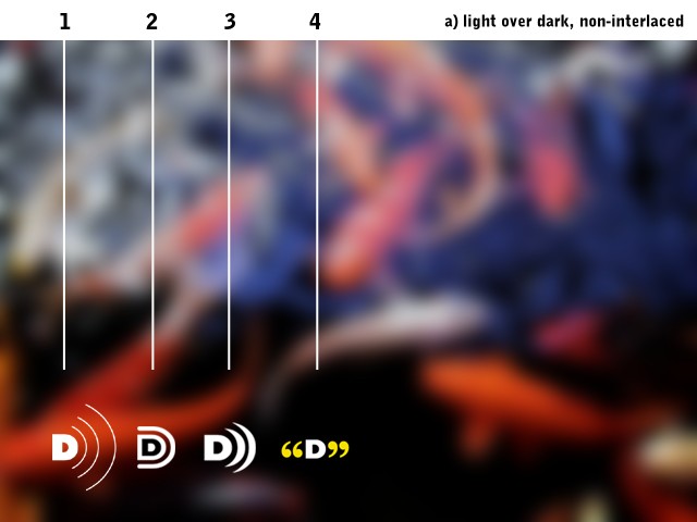
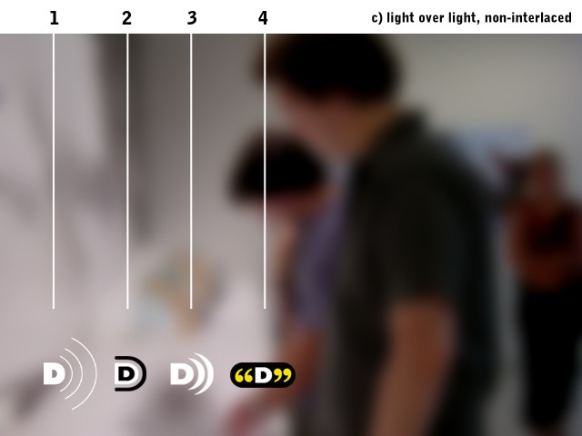
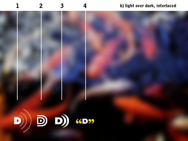
Next, Melanie produced some simulations of the current DVS symbol along with the improved DVS icon and the two candidate replacements. She designed the simulations with and without the interlacing of television – all those visible scanlines that mesh together to form a full image.
Here’s what the original DVS symbol, the improved DVS symbol, and the two candidate replacements look in simulated television frames. Remember, we don’t really want or need multiple symbols; they’re given for comparison purposes.

With no interlacing (i.e., without TV scanlines). If this looks like symbols laid on top of a photograph, it is. TV looks substantially worse than this. |

Light-coloured symbols on a light-coloured ground (a common and unpleasant occurrence). No interlacing here, so the appearance is somewhat nicer than on television. |

Light-coloured symbols on a dark-coloured interlaced ground. Interlacing provides a fair simulation of how things look on TV. Note that curved lines break up. |
And the winner is?
We don’t have a perfect simulation here, but it is clear from a cursory glance at the three simulations that:
- the original DVS symbol is too big and spindly for TV and breaks up too easily
- the two replacement symbols are not really that much better – the contoured D fares particularly poorly
- the D-in-quotes symbol is very nice and works well, but we don’t need another icon, to paraphrase Tina Turner
- the modified DVS symbol is even better than the real thing, to paraphrase U2
Horses and barns
To a certain extent (growing each and every day), the horse has bolted from the barn. The original DVS symbol is already in use.
But Melanie Goux’s redrawing is substantially better. For broadcast use, the original DVS icon should be retired immediately in favour of this redrawing.
No other symbols should be used.
And this redrawn symbol also works in French, given that “audio description” translates as descriptions sonores, a phrase beginning with D.
What about print?
What to use for the print medium? Might as well retire the old DVS symbol there, too. The icon no longer refers to DVS® brand descriptions, so it’s not as though the Descriptive Video Service at WGBH could really object to using the improved version.
In text-only uses (like TV listings and press releases, in E-mail, and on the Web, for that matter), Larry Goldberg of WGBH and I tend to favour simply writing D in parentheses – (D) – to indicate description. Compare that against using (CC) to indicate captioning.
Where are the files?
Melanie Goux’s universal description symbol is now available for download.
Comments? Questions? Concerns?
Feel free to write in with comments on the new and improved symbol.
Change history
- 2002.04.22
- Fixed typo and true DVS designer name (Paul Souza, not Chris Pullman).
- 2002.04.20
- Posted.